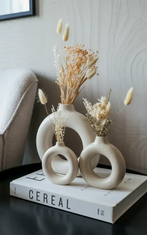
If you have ever tried to style white ceramic vases with dried flowers at home, you know that the difference between a magazine-worthy corner and a cluttered mess often comes down to a few small choices. I learned this the hard way after buying three matte white ceramic vases with delicate ring details from Walmart on a whim. I placed them on a black surface with dried bunny tail grass and cream-toned flowers, hoping for that calm minimalist look. Instead, I ended up with something that felt more busy than serene. That is when I started paying attention to the common mistakes people make with this exact setup, from the vase proportions to the props around them.
In this article, I am going to walk you through the five most frequent errors I see in minimalist decor arrangements featuring sculptural white ceramic vases and dried flowers. I will show you how to fix each one, using the exact photo you see here as our reference. By the end, you will know exactly how to recreate that cozy, uncluttered vibe without wasting money or time.
Mistake 1: Ignoring Vase Proportions When Matching Dried Flowers
The most common error is grabbing any ceramic vase and stuffing it with dried stems without considering the scale. In the photo, three vases sit together: one large ring, one medium ring, and one small ring. Each vase holds a different arrangement, but they all feel balanced. If you put a tall, airy stem like bunny tail grass into a short, wide vase, the whole thing looks top-heavy. If you use a tiny vase for a big bunch of flowers, it will tip over or look cramped.
To avoid this, think of the vase as the anchor and the flowers as the frame. Dried bunny tail grass, for instance, has soft, curved tops that work beautifully in a medium-height vase with a ring detail. Cream-toned dried flowers like statice or limonium pair better with a shorter, wider vase where the blooms can spread. The three-ring set in the image is a perfect example of how varying heights create visual rhythm without chaos. When you buy a set, pay attention to the ring shapes: larger rings give you more room for airy stems, while smaller rings are ideal for single stems or tight clusters.
Mistake 2: Overcrowding Your Dried Flower Arrangement
Minimalist decor is about breathing room, but many people stuff their ceramic vases with too many stems to make the arrangement feel “full.” That is a natural instinct, but it kills the calm look you are after. In the photo, each vase contains just a few stems of bunny tail grass and dried flowers. The cream and beige tones stay light, and the negative space around each stem lets the sculptural vase shape shine.
Here is a simple rule of thumb: use no more than three to five stems per small vase, five to seven per medium, and seven to ten per large. And always trim the stems at different lengths. For a cohesive look, choose dried flowers that all stay within the same creamy, beige, or warm white palette. Some of my favorites for this style include:
- Bunny tail grass (soft and fuzzy, naturally cream)
- Dried pampas grass plumes (fluffy, neutral)
- Oats or wheat stalks (thin, elegant)
- Dried hydrangea petals (papery, pale beige)
- Lamb’s ear stems (velvety, silvery green)
Keep it sparse. You can always add one more stem, but you cannot take away once it is packed in.
Mistake 3: Choosing the Wrong Surface or Background
The surface your vases sit on is just as important as the vases themselves. Many people place white ceramic on top of white tables or light wood, and everything blends together. That makes the vase shape disappear. In the photo, the three vases sit on a black surface, which creates a strong contrast. The matte white of the ceramic pops, and the ring details become very visible. The black surface also anchors the whole arrangement and adds a touch of modern sophistication.
If you want to replicate this look, try a black tray, a dark wood side table, or even a piece of black craft paper placed over a larger table. Dark surfaces hide dust and stem debris too, which is a practical bonus. Avoid glossy black if you can, because it reflects light and competes with the matte vase texture. A flat, matte black finish is ideal. And do not forget to leave some empty space around the vases. Clutter on the surface ruins the minimalist effect. In the photo, only the vases and a single book are present.
Mistake 4: Forgetting to Add a Thoughtful Prop Like a Book
A common mistake is to style the vases in isolation, leaving them floating on a surface. That can make the arrangement feel incomplete. In the reference image, a white hardcover book with the word “CEREAL” sits below the vases. That book does more than fill a gap. It adds a horizontal line that breaks up the vertical stems. It tells a story of a curated space. It also introduces a subtle texture via the paper cover.
When you add a prop, choose something simple and neutral. A stack of two or three books works too, but keep their spines monochrome. Avoid colorful covers or busy patterns. You can also use a small ceramic tray, a candle, or a single stone. The key is to let the vases remain the main focus. The prop is a supporting actor, not the star. In my own home, I use a plain white coffee table book with a matte finish. It ties the whole look together without screaming for attention.
Mistake 5: Assuming Higher Cost Means Better Aesthetic
Many people believe that achieving a cozy, sculptural look requires expensive designer vases. That could not be further from the truth. The three matte white ceramic vases in the photo were found at Walmart for a very reasonable price. They have that smooth, minimalist silhouette with ring details that would usually cost four times as much at a specialty store. The lesson is that quality design is available at any price point if you know what to look for.
When shopping for affordable ceramic vases, check the finish. A matte, slightly porous surface looks more natural and high-end than a glossy, plastic-like coating. Look for clean lines and details like rings or ridges that catch light. Walmart, Target, and even thrift stores often carry ceramic vases that are identical in shape to high-end brands. The only difference is the price tag. Do not overlook Walmart decor. It is a goldmine for minimalist finds, especially when you pair it with dried flowers from your local craft store or even your own garden.
Another mistake is thinking you need to replace the flowers every season. Dried flowers last for months, sometimes years, if kept out of direct sunlight. That makes the whole arrangement incredibly cost-effective. You spend once on the vases, once on the dried stems, and then you are set for a long time. It is a smart way to decorate without constant spending.
Mistake 6: Overlooking the Power of Sculptural Ring Details
The ring details on these vases are not just decorative. They change the way you interact with the flowers. In the photo, one vase has a large vertical ring around its body, another has a medium ring, and the smallest has a thin horizontal ring. These rings create visual tension and break up the vase’s silhouette. Without them, the vases would be simple cylinders, which are fine but less interesting.
Avoid choosing vases with too many competing details. One or two rings, a subtle rib, or a gentle curve is enough. If the vase has heavy texture or bright colors, it will clash with the dried flowers. Stick to matte white, which lets the shadow of the ring create its own design. When arranging stems, position them so they emerge from the ring rather than covering it. Leave some stems short so the ring stays visible. That small attention to detail makes your arrangement look intentional and refined.
How to Bring It All Together for a Cozy Corner
Once you avoid these common mistakes, putting together a cozy corner is straightforward. Start with your black surface, then place your vases at slightly different heights or distances. I like to put the tallest vase slightly behind the others. Add your dried flowers one stem at a time, stepping back to check the balance. Then slide a simple book in front or beside the group. Light a candle if you want extra warmth, but keep the palette neutral.
The result should feel calm, airy, and effortless. That is the whole point of minimalist decor. It is not about having less for the sake of having less. It is about choosing pieces that speak clearly and letting them breathe. If you can master that, your home will feel like a sanctuary even on busy days.
Now I would love to see what you come up with. Try this setup with whatever vases and dried flowers you have on hand. Share a photo of your own cozy corner and tag it with #cozyhome or #walmartdecor so we can all learn from each other. Happy styling.
#ceramicvases #driedflowers #minimalistdecor #walmartdecor #cozyhome
Leave a Comment